
Writing for the web
Scannable content
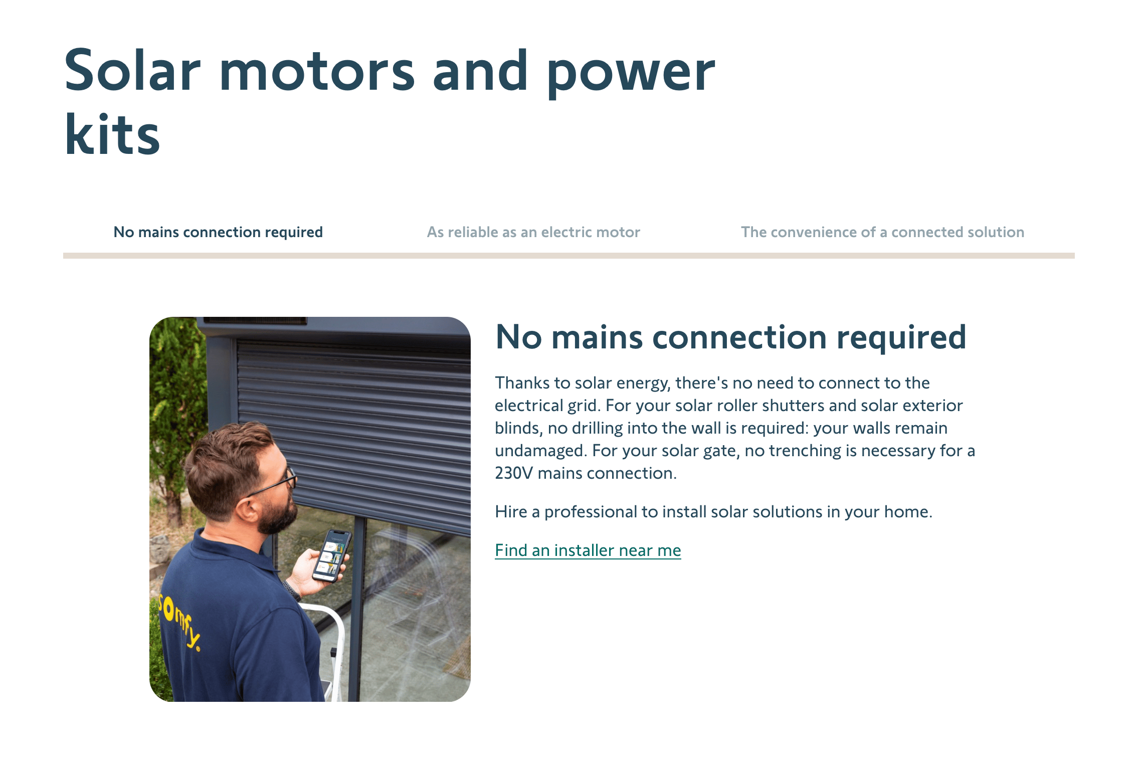
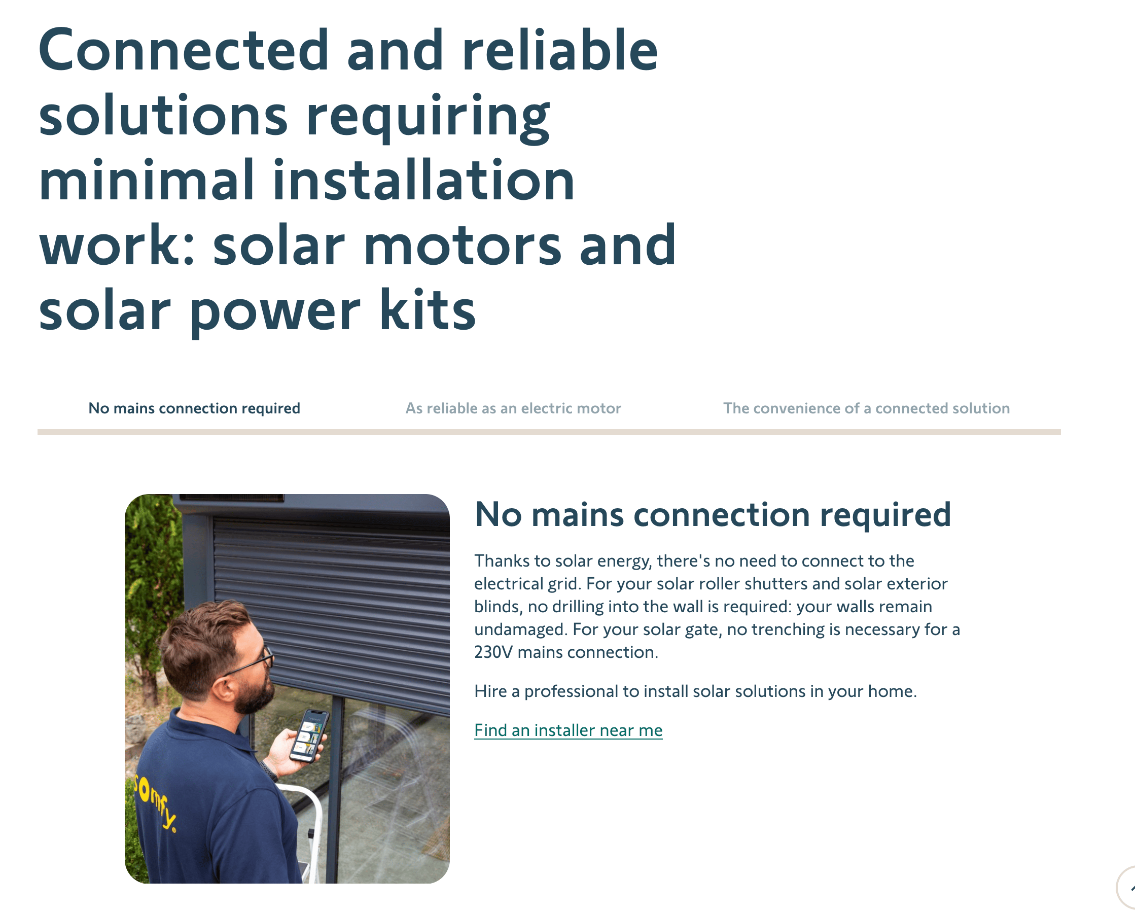
Define a clear page hierarchy
A good hierarchy helps to scan quickly and understand the structure of the page.
Use titles to give a clear summary of the page and use the inverted pyramid scheme to design your content structure where big titles enclose smaller sections which enclose blocks. The more the user scrolls through the page, the more into details they get. [3]
When appropriate:
- Have a unique title of the page
- Have main sections/blocks (every 300 to 500 words). These blocks have titles.
- Have subsections if necessary
- CTA’s level should match block importance (Primary, Secondary, link)
Write short titles
Titles need to be to the point and short. They introduce what is detailed in the text below.
If more context is needed, use subtitles. Cut overly detailed information in the title, but don’t aim for a false promise or marketing catch.
Don’t crop titles that are bond to a legal-validated sentence.

Try this
Keep things short and interesting

Avoid this
A centered, long title is hard to read and breaks the hierarchy
Write easy to read paragraphs
Keep the content short (in some cases, halving the word count improved readability by about 58% [2])
- Avoid blocks of text that are too dense, as they discourage rapid reading when scrolling
- 2 to 4 lines per paragraph maximum
- Or 3 to 6 “visual” lines per block (e.g. in bulleted list)
Don’t remove important or legal information to respect the anti-greenwashing policies (see more here). If necessary, when content is essential and too big, split this content in two consecutive blocks
Avoid this
Title doesn’t give sense of what the section is about.
Avoid this
Too much text on a page overwhelms the reader
Using “head titles” (over-title) and subtitles
“Head-titles” and subtitles optional and should be only used when they help to the comprehension.
- Head titles (displayed over block titles) are to be used sparingly.
Use head titles only when it helps the user scan the page or group things together. Keep it to one or few words, like a content tag.
- Subtitles (displayed below block titles) can be used when more context is necessary or to define sub sections.
Try this
Main title for the theme, subtitle for more context
Avoid this
Too many levels of titles decrease scannability
Align text to the left
- Don’t mix “Left-aligned” and “center-aligned” blocks
- Avoid centered or justified text since it is harder to read
- Use left-aligned text. A consistent left margin makes reading easier [1]
Try this
Left-centered content is easier to read
Avoid this
Avoid mixing different text positionning
Sources and why’s
[1] : Design for readability : Use left-aligned text, Harvard University, Digital Acessibility (En)
[2] : How Users Read on the Web, NNGroup (En)
[3] : What is readability in UX Design, Interaction Design Foundation (En)
- Legal, Ethics and Compliance, Somfy Internal (En)


