
Writing for the web
Hyperlinks and CTAs
A clear and effective call-to-action (CTA) can help drive conversions. It is also necessary for accessibility and helps SEO.
Naming Call to Actions
Use action-oriented and descriptive text to guide the user effectively.

Try this
Be specific and action-oriented

Avoid this

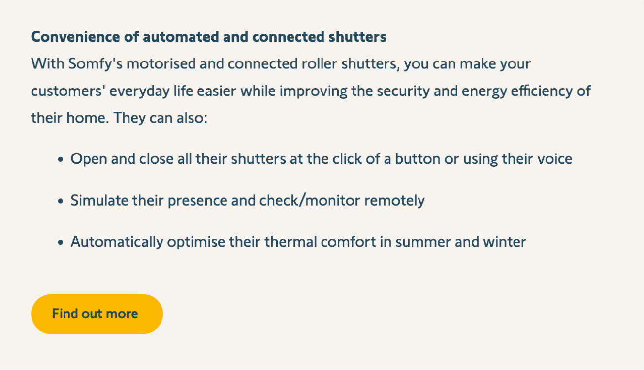
Avoid generic “Find out more”
Check if the text fits
Avoid getting too long as it might not fit the UI. Check the UI in context and different resolutions if unsure.
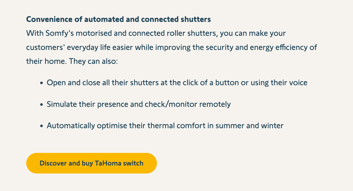
Try this
Detailed CTA that fits the UI
Avoid this

Detailed but too long for the UI context
Create hierarchy with CTAs level
Primary CTAs are the strongest interactional element in Somfy’s websites. Therefore it should be used only a few times per page at maximum, when needed. Too many CTAs at the same level will create confusion to the user. (See Choice paradox [2])→ Avoid using Primary CTAs for navigational purpose. Use links or secondary CTAs for these purposes.
Try this

Make the main choice obvious for the user
Avoid this
Everything at the same hierarchy forces the user to read everything before making a choice
Naming links
A link name should be understandable, clear, and explicit. [3]
- A link label should be understandable by itself
- If that is not possible, the link's purpose should be understandable within its context (ie the paragraph, list item, or sentence it is in)
Links are typically used in a paragraph of text or by itself, often at the end of a paragraph. Avoid lists of links at the same level as it might confuse the user on where to go next. [4]
Try this
No-Context needed for links in a paragraph of text
Avoid adding directions to the link itself like “Click here”. The underlying action should be enough to guide the user
Try this
Link is understandable by itself and SEO friendly
Avoid this

Don’t direct the user on a generic “click here”
Sources and why’s
[1] : Screen readers can read all CTA’s in sequence and out of their context. Having a distinct and clear naming will help the user choose the right path.
[2] : Choice paradox, Laws of Ux[3] : WCAG 2.2 . Link purpose (In context) 2.4.4.


