
Writing for the web
Accessibility
Content should be easy to understand
Words have power, but only if they’re understood. Some users may be cognitively impaired from a temporary situation or permanent.
Few tips to make your content easier to read:
- Short sentences
- Clear structure
- Words everyone understands (also avoid jargon)
- Left align text only
If content requires reading skills above lower secondary education (around 9th grade), to help with understanding provide: [1]
- A simpler version
- A summary
- A visual aid
Text color
Use default text style options when available as it represents Somfy’s Design official sets of colors. Respect ‘AA’ accessibility standards at minimum.
Possible text colors (common for B2C and B2B):
Smart Blue
#
25485A
Text colors
Dark Smart Blue
#
1E3A48
Usage
Example
Exemple
Exemple
Links
#
016B65
Exemple
Success
#
3F7E71
Exemple
Alert
#
BB2D46
Exemple
Light Smart Blue
#
667983
Exemple
Normal text for B2C
Normal text for B2B
Text links
Success color
Error color and Sales color
White
#
FFFFFF
Seconday text
Alternating colors
Exemple
Checking contrast
As Somfy is legally required to be compliant with the “AA” accessibility standard, it is important to check the contrast when using a custom text and background color combinations.
According to WCAG 2.0 Level AA guidelines:
- The contrast ratio must be at least 4.5:1 for normal text.
- For large text, the minimum contrast ratio is 3:1.
- A higher contrast ratio is always preferred for better accessibility.
Use the online tool linked below to verify your color combinations. Simply input a foreground and background color, and ensure that the results meet the requirements in the AA column.

Accessibility checking tool ( https://accessibleweb.com/color-contrast-checker/ )

Try this
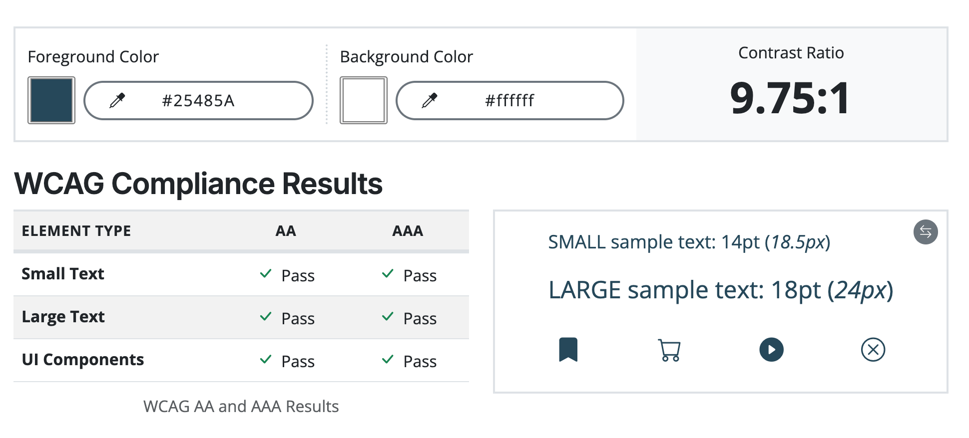
Use Smart Blue or Dark Smart Blue over light background

Avoid this
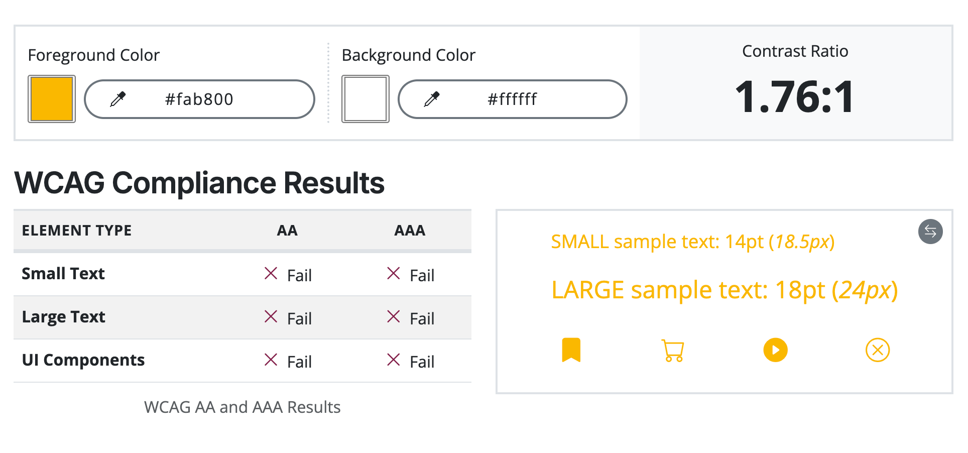
Do not use Yellow as text or icons as it fails contrasts requirements
Try this
Stick to the standard Somfy palette to ensure accessibility and harmony
Avoid this

Somfy’s yellow isn’t accessible over white or beige background. Use bold and link color in this scenario
Don’t use the following combinations as they fail accessibility requirement :
Avoid this
Yellow over beige
White over yellow
Yellow over white

